작가소개
가구디자이너 곽철안 씨는 멀티플레이어입니다.
대학 시절 프리랜서로 시작한 상업 가구디자인부터 작가로서의 작업,
이제는 대학교수라는 직함을 가지고 있는 그는 가구계에서 다양한 활동을 통해 자신만의 열정을 보여주고 있습니다.
Furniture Designer Kwak Chul-an is a multiplayer.
Starting as a freelancer in university, then as an artist, and now as a university professor,
he has been showing his passion in commercial furniture design by engaging
in through various activities in the furniture world.
작품설명
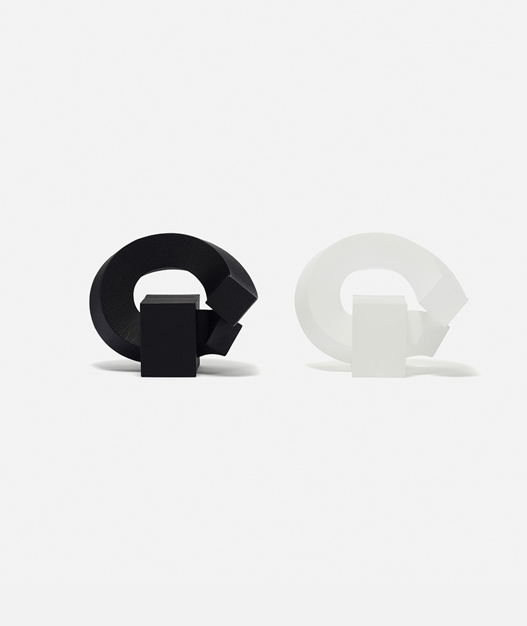
붓과 먹을 이용하여 글을 쓰는 것은 펜과 잉크를 사용한 표현과는 구분된다.
먹을 묻히는 붓은 기본적으로 입체이므로 여러 면이 존재하고, 그 중 종이와 닿는 면을 선택해 글을 쓴다.
따라서 획이 그어지는 방향에 따라 종이와 닿는 붓의 면이 달라지는 데, 즉 붓으로 글을 쓰다 보면 획이 꺾이는 부분에서
붓과 종이가 닿는 면이 바뀌며, 마치 입체의 면이 뒤집히는 것과 같은 효과가 생긴다.
여러 면이 존재하는 한글의 붓글씨를 입방체의 획으로 보고 한글을 공간에 쓴다는 개념으로,
필기구조(Cursive Structure)라 이름 지었으며, 작품에서 보여지는 획의 굵기를 일정하게 하여,
조형적 긴장감을 유지하고자 하였다.
붓글씨의 ‘획’에서 느껴지는 힘과 무게감을 표현하기 위해 ‘먹색’에 가까운 흑색으로 마감하여,
평면 속 한글의 붓글씨가 가진 입체성을 공간에 표현하였다.
Writing with a brush and ink is different from recording with a pen and ink.
The brush that you dip in ink is basically three-dimensional with several sides to it, and writing requires
that you choose a side of the brush to contact the paper. Depending on the direction of the stroke,
the side of the brush that touches the paper changes.
In other words, when the stroke changes course while writing with a brush,
the side of the brush that touches the paper also changes,
creating an effect similar to a three-dimensional structure being flipped over.
The artist named his works "Cursive Structure," which are based on a concept of writing Hangul letters in space,
whereby the brush calligraphy of Korean letters that have several sides to them are regarded as cubic strokes.
He maintains formative tension by keeping the thickness of the strokes constant and finishes his works in black,
a color similar to the color of "ink," to express the power and weight felt in the "strokes" of the brush calligraphy and
to portray the three-dimensionality that Korean calligraphy, previously written on a plane, can have in space.